PyVisA: Visualization and analysis of path sampling results
In this example, we become familiar with PyVisA. Every example on the website can be used to generate data for the analysis.
PyVisA is composed of two units: a compressor tool and a
visualization tool. The visualization tool requires the additional
installation of PyQt5. Both units can be executed directly with the
pyvisa command or used as a Python library.
Here, we illustrate the command-line usage of the PyVisA components.
Since clusters might not support GUIs or the related packages, such as PyQt5,
PyQt5 is not a prerequisite for PyRETIS or PyVisA. To operate the
PyVisA GUI visualizer, PyQt5 must therefore be installed manually, for
example with pip.
Compressor
The compressor tool can be executed with:
pyvisa -i <input_file> -cmp
where <input_file> is the same .rst file used to execute the PyRETIS
simulations.
PyVisA will read, for each folder, the energy and the order parameter files.
It will check the consistency and integrity of each file and discard
corrupted data. The compressor tool will then generate a binary file,
.hdf5 by default, where all the input files are condensed, compressed,
and organized to simplify the following post-processing operations.
The compressor tool reports file inconsistencies, such as corrupted files or mismatched cycles. This situation might happen when the simulation data have been produced by multiple machines and/or by multiple independent runs.
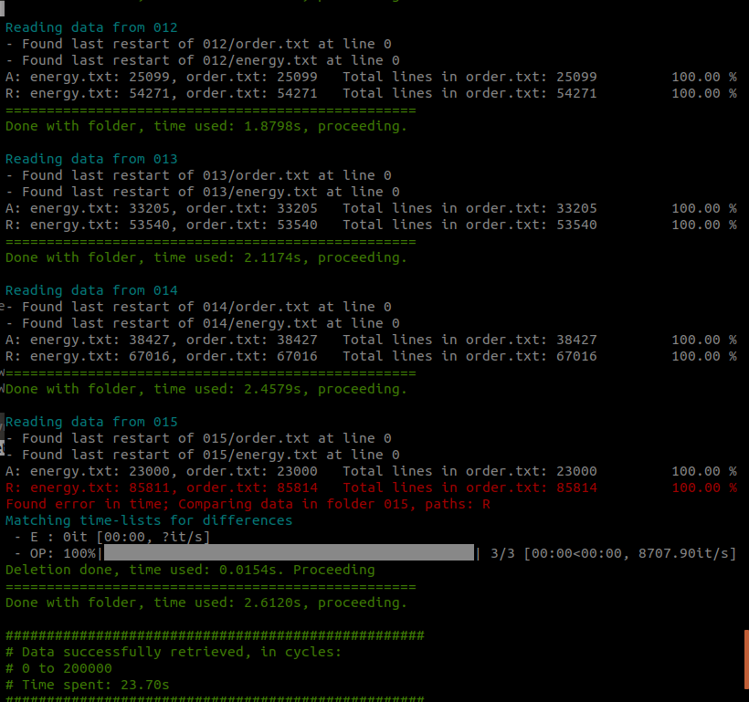
Fig. 47 A report on the reading and consistency check for each ensemble and for each file is provided by the compressor tool.
The source files are not touched by this operation. If the data consistency is very low, a manual check is required before importing the data.
Visualization
The visualization tool can be executed with:
pyvisa -i <input_file>
where <input_file> can either be the .rst PyRETIS input file or the
compressed file generated by the compressor tool, .hdf5 by default.
The PyVisA GUI has two main panels: data and plotting.
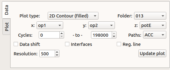
Fig. 48 Data panel: select the plotting type and data sub-set.
The plot types are defined by:
- Plot type: select the Matplotlib plot type and the number of dimensions to use. When plotting density maps, path weighting of accepted trajectories is an option.
Data sub-sets selection
Data selection and manipulation criteria are:
- x, y, z: list of order parameters, cycles and timesteps. Also, y, z allows the selection of the kinetic, potential, and total energy (kinetic+potential).
- Folder: choose an ensemble number or select all of them.
- Paths: accepted (
ACC), rejected (REJ), or both (BOTH). See Path status codes for all status codes. - Cycles: select the minimum and maximum cycle number, where a cycle is a Monte Carlo move, i.e. a trajectory for each ensemble.
- Data shift: shift the x-y data. This can be useful in the case of a cyclic order parameter such as an angle or dihedral.
- Interfaces: toggle interface lines (2D plot) or planes (3D plot) It requires that x is the main order parameter (OP1).
- Reg. line: plot a linear regression line and report its slope, intercept and r–squared values.
- Resolution: number of pixels or grid–points to use for density, surface plot types. For scatter plots, it controls the dot size.
Plotting
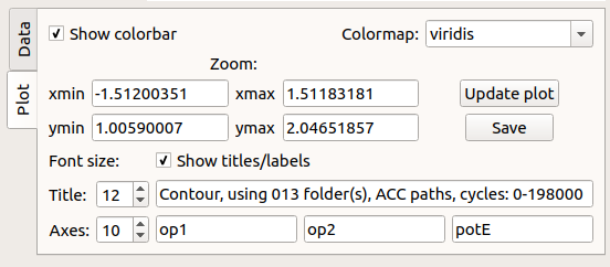
Fig. 49 Plotting panel: select the various plotting preferences.
From the GUI, without reloading the data, it is possible to manipulate the picture. The options are:
- Colormap: the colormaps to use for the plot.
- xmin/xmax: minimum and maximum x–values in the plot.
- ymin/ymax: minimum and maximum y–values in the plot.
- Save: save the figure in a
.pngfile. - Font size, Titles/Axes: the font size of plot titles and axis labels.
- Show titles/labels: display the plot titles and axis labels.
Data handling
Further options can be accessed from the drop-down panel labeled **File**.
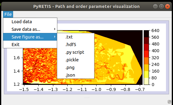
Fig. 50 A drop-down menu for file operations.
The drop-down menu contains a few options:
Data Loading: reload the compressed simulation data.
Data Saving: save the simulation data, for example with the compressor tool, in
.hdf5format.Figure save: save the current data selection/picture. Several options are here available. To further facilitate data handling, PyVisA can save the selected data in very different ways. The idea is to minimize user efforts in data manipulation. In all the following selections, the file name is automatically generated to contain all the information for (manually) reconstructing the plot.
The figure’s data can be saved in:
- Raw format:
.txtfile. Other visualization software can directly be used (e.g. xmgrace, gnuplot). - JSON format:
.jsonfile. This allows users to directly access the numbers corresponding to a plot and/or load them via the JSON package.
The figure’s object can be saved in:
.hdf5: a versatile compressed format that can be loaded also by other programming languages (e.g. R).
The figure itself can be saved as:
figure.png: a.pngfile.script.py: a Python program is generated to reproduce the selected plot from the compressed data simply by typingpython <name_file.py>.
- Raw format:
A large variety of plots can thus be generated via PyVisA. The respective data can be saved in different formats to further facilitate post-processing and analysis in different programming languages.